- 올인원 프로필링크, 리틀리
- 세상 쉽고 깔끔한 페이지 만들기 리틀리
When starting website planning, many people face difficulties in content or layout structuring. This task, which needs to be separately planned for desktop, tablet, and mobile environments, can be particularly challenging for small businesses or freelancers who handle everything themselves. Nowadays, many people are using website builders to simplify this process.
While website builders offer user-friendly convenience, they aren't perfect in the realm of responsive design. Without coding knowledge, creating separate mobile, PC, and tablet screens during the initial design and subsequent editing process becomes necessary. This task, while seemingly trivial, can be time-consuming and cumbersome. In today's article, instead of the traditional approach of creating unique website versions for desktop, tablet, and mobile, we'll explore how to build an optimal mobile-responsive single website within a single environment.
No More Device-Specific
Screen Planning for Responsive Websites
Planning and developing websites tailored to various device environments has been a long-standing practice. Especially if you're running a small business, you can skip this complex process. For small businesses, accurate and concise information delivery is more important than flashy designs.
Responsive web design has long been a priority for businesses and business operating users seeking to connect with users across various devices. However, the traditional approach of meticulously planning and designing device-specific screens necessitates a complex process that requires time, effort, and significant manpower, consistently classifying website development projects as large-scale undertakings. While these tasks have been simplified through web builder platforms, most web builder platforms still require individual content updates and layout adjustments for each device, making the process time-consuming.
Using a mobile-optimized website builder rather than the commonly known desktop-based web builders allows you to create a unified web experience that seamlessly adapts to various devices. Using a single-type website ensures consistent content, branding, and user interface across desktop, tablet, and mobile devices, eliminating the need to maintain separate layouts and design variations.
Features of Mobile-Specific Website Builders
Integration with Various SNS Channels
Mobile-optimized single websites can be freely utilized through integration with various SNS channels. Being optimized for mobile environments rather than PC-based screens, it offers high usability on Instagram and other mobile-based SNS platforms. This is useful for companies and individual freelancers who need to interact with customers through SNS.
Increased Time and Resource Efficiency Through Simplified Content Management
When updating content on a site, you don't need to update the formatting each time for different device environments. You can reduce time wasted on repetitive tasks like editing images and updating content for each environment daily. All tasks, such as adding new posts, products, or services, can be performed on a single page, reducing hesitation in posting new content.
Desktop vs. Mobile-Based Website Builders
Points to Consider When Choosing
Mobile-based website builders offer a variety of features and are easy to use, but it's important to consider the following points before choosing a site builder.
Characteristics of the Target Customer Base
If your target customer base primarily uses desktops, you should consider a desktop-only website instead of a mobile-optimized website. For example, if you are providing professional business services, it's necessary to structure your website around desktop users.
Instead of a website, you can build a mobile-optimized sub-website through social media to communicate more closely with customers. Relatively heavy business websites may find it difficult to engage in friendly communication with customers.
Content Type
If you require complex graphics or data visualization, it's recommended to use a desktop web builder. However, if your content primarily consists of simple text and images to present concise information, it can be visually more appealing on a mobile screen, so use a suitable web builder based on the content type.
Analysis of User Behavior Data by Device
Websites built with desktop-only web builders may make it difficult to track mobile traffic data. It's possible to embed and track detailed codes primarily based on desktop pages, but mobile environments are often simplified, causing some detailed data to be missed. However, since mobile web builders provide the same page for both desktop and mobile, you can obtain data from both devices without any omissions and utilize this data to understand user behavior and optimize your website.
Responding to New Mobile Devices
Mobile devices are constantly being updated. Not only tablets and smartphones but also various devices with different screen ratios capable of internet connectivity are being released. Websites built with desktop-only web builders may find it more difficult to adapt to new mobile devices, and may require additional work and updates. Building a site with a mobile web builder offers a flexible page layout that can adapt to both mobile and desktop environments for the future, eliminating the need for additional screen configuration work.
Exploring Examples of Mobile-Focused Websites
Sub-Websites Used by Businesses
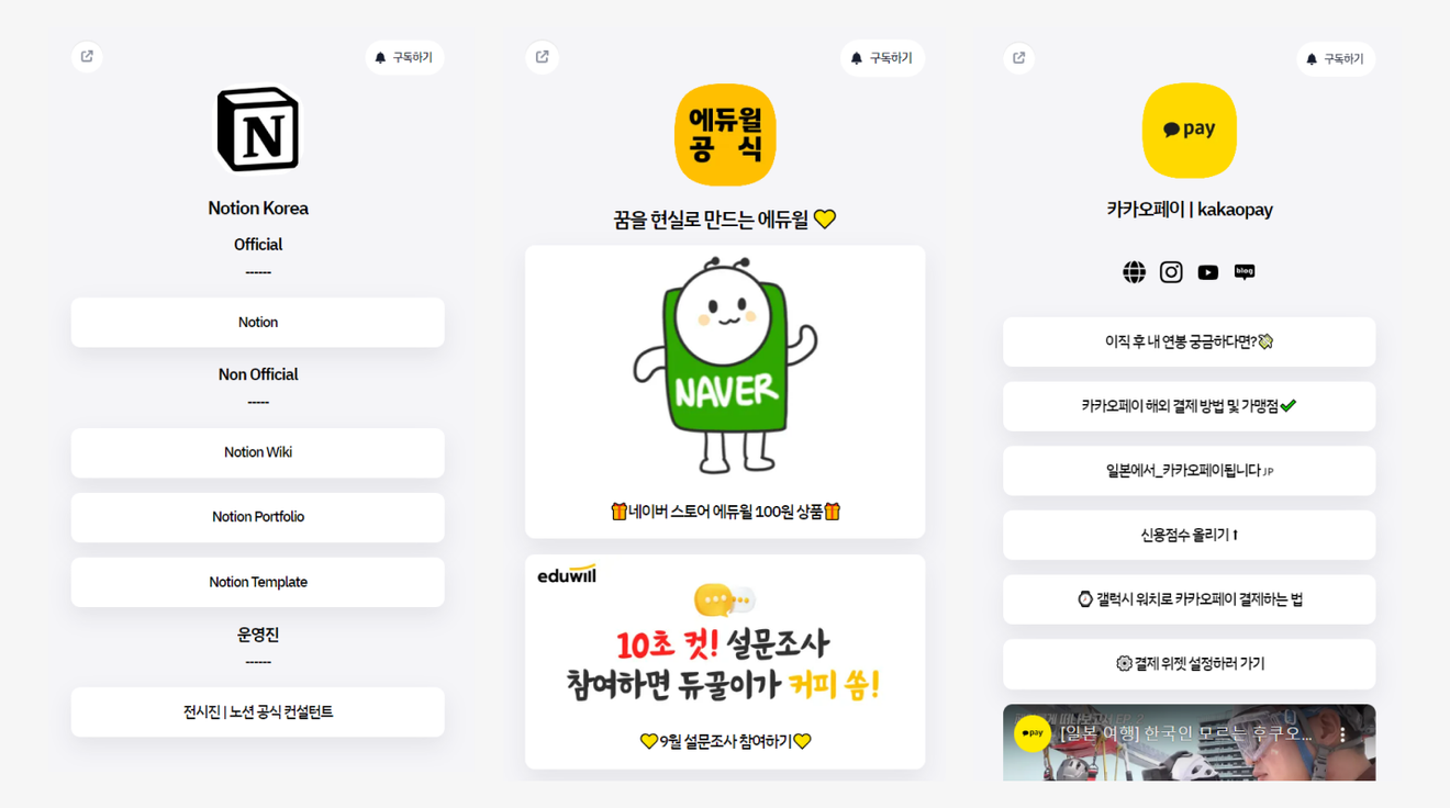
Examples of company mobile-specific websites: Notion, Eduwill, Kakaopay Littlely page
Mobile-based websites are effectively used on various social media platforms. In particular, businesses with desktop-based sites may experience compatibility issues on mobile devices or fail to effectively showcase desired content. Through this, companies interact with customers using mobile-optimized sites to showcase brand-related campaigns and key product features on each social channel.
Freelancer Product/Talent Sales and Introduction Sites
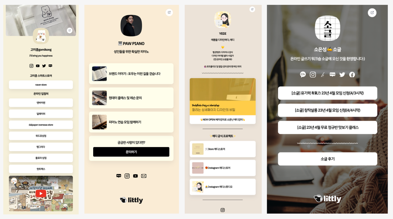
Examples of Freelance Websites
Freelancers may find it cumbersome to build and constantly update a separate website. Simply managing project time can be overwhelming. Mobile-only websites reduce this management demand for freelancers while enabling the creation of appealing sites.
Through mobile website builders, freelancers can not only build simple sites but also monetize through product and talent sales, receive sponsorship from fans, and freely receive business inquiries. They can expose and utilize essential features for managing their side projects and selling products/services directly on their sites without any coding or integration processes.
Easily Build a Mobile-Optimized Site
with Littly
What is the Website Builder Platform Littly?
Littly is, simply put, a website builder that allows you to gather and display all channels related to your business or brand in one place. Websites created through Littly are mobile-optimized, displaying the same screen on both PC and mobile, eliminating the need for separate device-specific screen planning. It's a website builder platform that allows you to easily create websites for various purposes such as simple promotion, product sales, and websites for SNS profile links.
In Conclusion
In the constantly evolving digital landscape, having a mobile-optimized website is no longer an option but a necessity. Search engines like Google are also continuously updating with a mobile-first approach. If you're preparing a mobile-optimized website, try Littly. Effective design tools, templates, and a user-friendly interface make creating mobile-optimized websites easier than ever. You can sign up now and start creating your site.

Comments0